Just as of recent, NYP AI launched its official websites.
nyp.ai was released on 23rd October 2020, together with our Public Affairs site and our blog (The Data Entries).
I am Dylan Kok, the designer of nyp.ai and all its related sites and the Vice President of Media & Publicity, here at NYP AI. In this post, I am going to talk about the design process of NYP AI's websites.
Why did it take so long
Much thought was placed into the looks and feel of the website. A website is the online identity of any organisation and it is the key in engaging first time visitors and potential new members.
Forget about anything else if the first impression is trash.
– My basic design philosophy
We wanted something unique, something no one else has. Hence, a completely new design system had to be deliberated upon. "Maru" was born on 19th October 2020 in order to introduce the branding standards of the NYP AI brand. From there on, Maru was expanded to cover the designs of posters and now, the website.
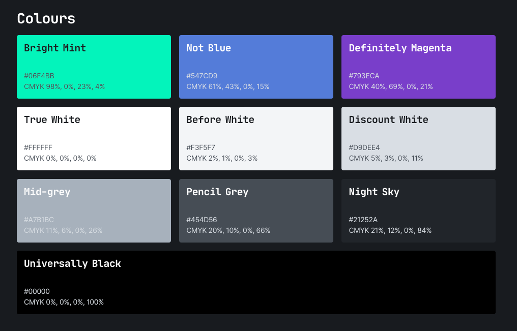
Maru 丸
Maru was build around the colours of the NYP AI logo. Bright Mint, Not Blue & Definitely Magenta are colours of the gradient used in the logo.
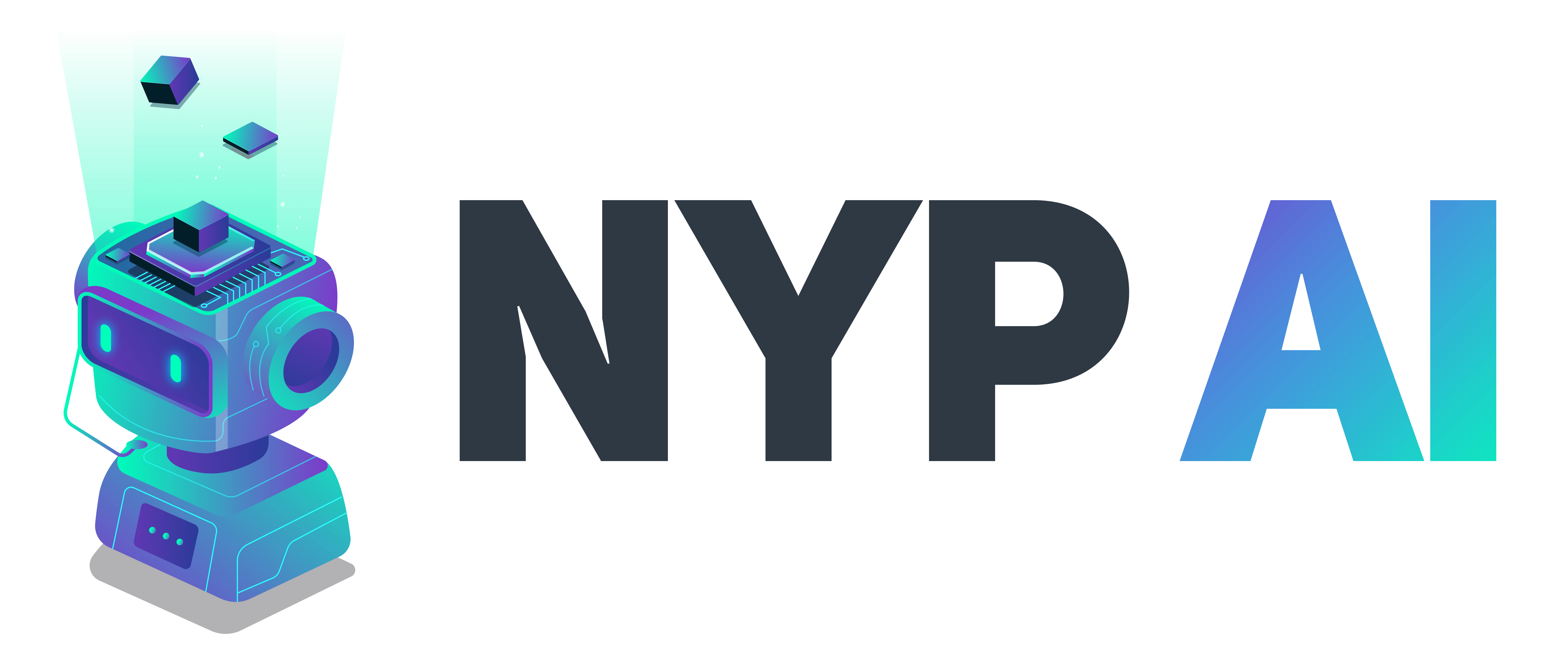
The emphasis on "AI" was emphasised by the usage of the gradient. With this, we applied the gradient on words that we wish to emphasise on our websites.
Connecting the dots
NYP AI is all about fun, but sometimes, we got to keep it tasteful and professional. With this, I refused to use too many colours when building up Maru. Sections of the website were not split by colours, but by lines. Not just any lines, I used dots.
Why use dots? Simple. Lines are cliché.
I'm quite font of the fonts
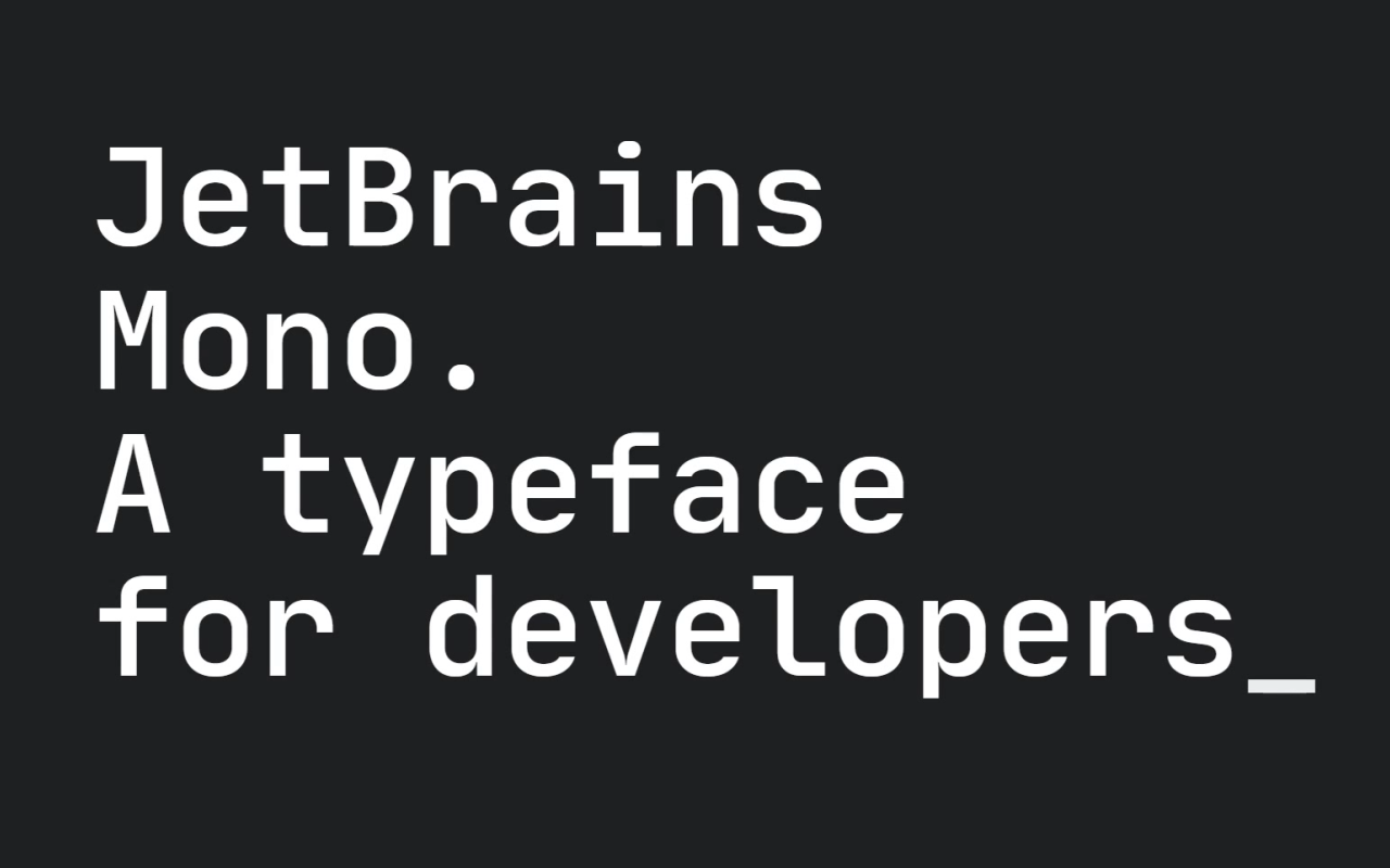
Jetbrains Mono & Inter are the two primary fonts used on nyp.ai. Uni Sans is used for the logo.
Inter looks modern, uncluttered and minimalistic.
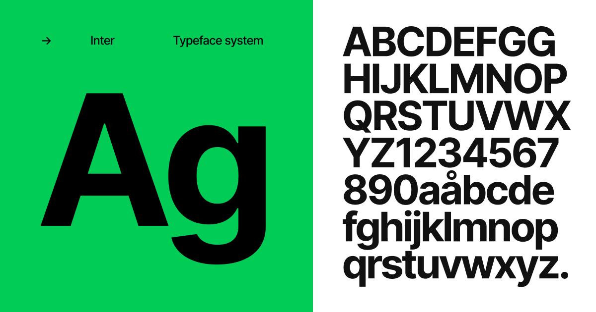
Jetbrains Mono on the other hand is brings emphasis to any text it is applied on. Hence I used it on all titles and texts we want to bring the readers eyes to.
On another note, it's simply programmer-like.
That's pretty much all it is to it
There isn't any special formula, no magic, no nothing. It is, simply, what it is.
A simple website, along with some design standards. That is all it takes to build a stunning, yet minimalistic website.
What's next
As more events are coming up, Maru will make its into the design of our presentation slides.
Till then!
